NWEA Brand Refresh
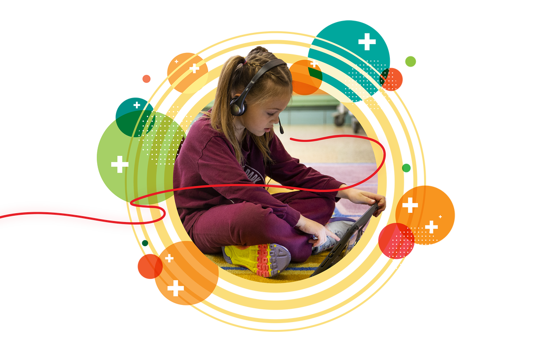
The visual identity refresh consisted of developing a system that defines a strong bond and distinction between corporate NWEA brand and the MAP Suite product line.
Design lead for NWEA, MAP Reading Fluency, MAP Skills
Art Director: Yosh White
Brand Photography : DW Johnson
Design
The visual identity refresh consisted of developing a system that defines a strong bond and distinction between corporate NWEA brand and the MAP Suite product line.
Design lead for NWEA, MAP Reading Fluency, MAP Skills
Art Director: Yosh White
Brand Photography : DW Johnson
Design
MAP Reading Fluency
Unique to the product, the aspect of student voice is represented through the organic ribbon line and the vibration of circles
Unique to the product, the aspect of student voice is represented through the organic ribbon line and the vibration of circles
MAP Skills
Open dot circles and strands identify and support student need and progression
Open dot circles and strands identify and support student need and progression
NWEA Corporate
The constellation comprised of pluses creates an organic form that radiates with potential. It serves as a guide and support—empowering through the process of discovery.
The constellation comprised of pluses creates an organic form that radiates with potential. It serves as a guide and support—empowering through the process of discovery.


